Book-Matching Stone Worktops: A Stunning Visual for Your Kitchen
If you’re unfamiliar with the term ‘book-matched stone’, you’re not alone. At SEH Interiors, we offer book matching for our sintered stone worktops. But we’ve found many people are unaware of this technique and the incredible impact it can have on the overall aesthetics of their kitchen.
In this blog, we’ll take you through everything you need to know about book-matching stone worktops. We’ll explore what book-matched stone is and discuss the numerous benefits it brings to your kitchen. We’ll also provide guidance on where to best use book-matched sintered stone in your kitchen to ensure maximum impact and cohesion with your overall design.
What does book-matching stone worktops mean?
Book-matching stone worktops is when two worktop slabs are fabricated so their patterns and veining mirror each other when joined side by side. The veining continues from one slab to the other, creating a continuous design. Together, the two slabs create a visually captivating surface that effortlessly elevates the style of a kitchen.
This effect can be created using natural stone materials or engineered stone, such as sintered stone.
What are the benefits of book-matched stone worktops?
When it comes to kitchen design, attention to detail is crucial. Book-matched stone worktops provide an exquisite touch of luxury that goes beyond standard worktop installations. For example:
- They create an eye-catching design element, giving you and your visitors the wow factor every time you enter your kitchen.
- They highlight the unique characteristics of the stone’s intricate patterns and colours.
- Depending on the design, they can add drama, depth, or a feeling of movement to your space.
The only slight downside to book-matched stone worktops is the cost. As you’d expect, they typically cost more than standard slabs because more material may be needed to fabricate them, and they are labour-intensive. However, the investment is worth it considering their visual impact and the value they add to your home.
Where to use book-matched stone in your kitchen
Book-matched stone worktops offer endless possibilities for enhancing various areas of your kitchen.
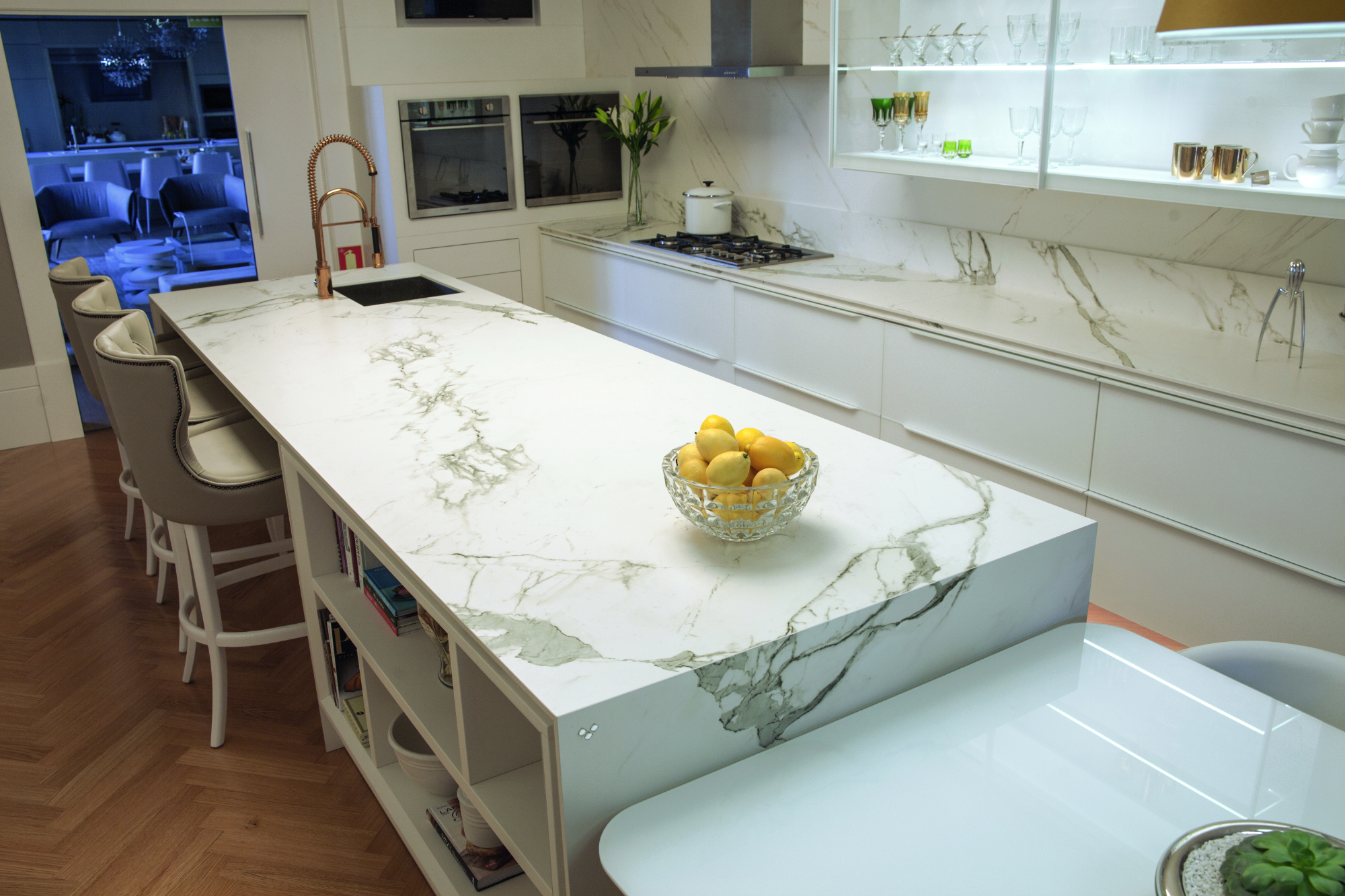
One perfect location is on a long kitchen island. Book matching becomes an ideal solution when a standard-sized slab isn’t available to fit seamlessly as one piece on an island. By carefully aligning two book-matched slabs, you can create a continuous and symmetrical pattern that runs the island’s length, turning it into a captivating focal point.
Another area where book-matched stone shines is on a splashback. Whether you have a large wall or a specific section in mind, incorporating it into your kitchen design can provide a striking visual impact.
It’s also particularly effective when used across a horizontal and vertical surface, for example, on the worktop and adjoining splashback. The mirrored effect adds a dimension to the space that accentuates the beauty of both the worktop and the surrounding area.
It’s important to note that book-matched stone is best displayed in large, open areas. So, avoid using it in cramped or confined spaces, where it’s hidden by appliances or interrupted by corners. Instead, turn it into a work of art by selecting areas where the pattern can be fully displayed and admired.
What are the best sintered stone colours for book matching?
Sintered stone colours suitable for book matching have distinctive veining with strong movement in a colour that stands out against the stone’s base colour.
At SEH Interiors, we supply and install the following book-matched sintered stone colours
Dekton® Morpheus
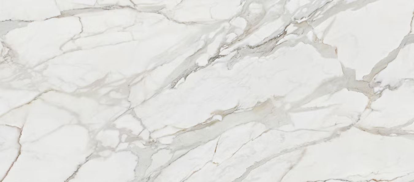
Dekton® Morpheus has a soft cream base with veins in a mix of golden and blue tones and many shades, reflections, and glints of colour.
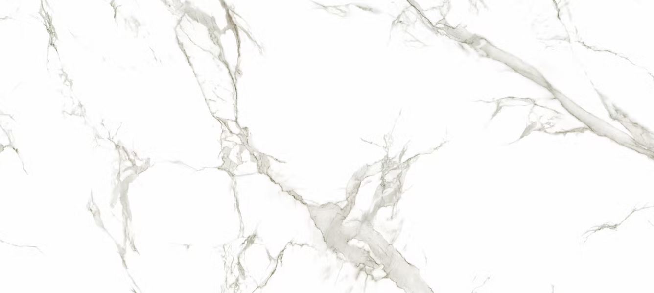
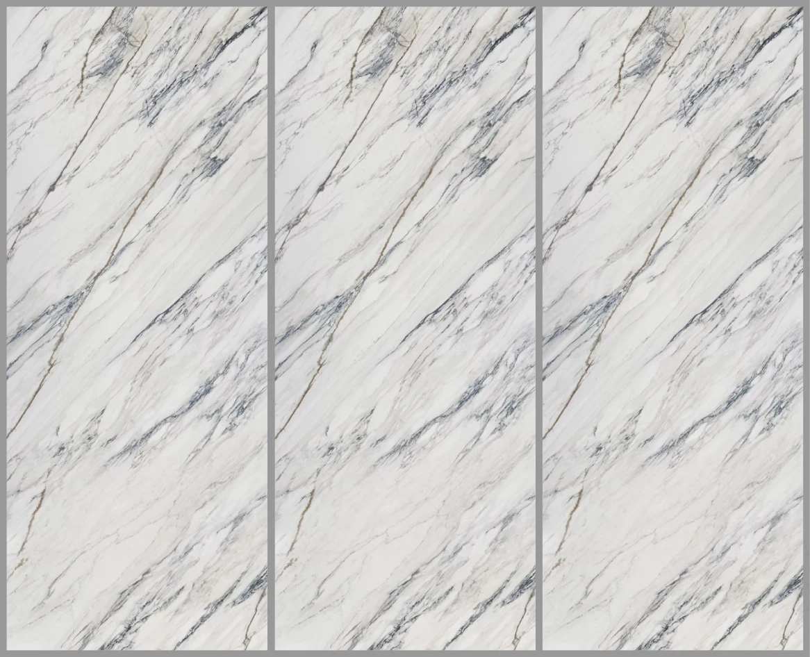
Dekton® Natura 22
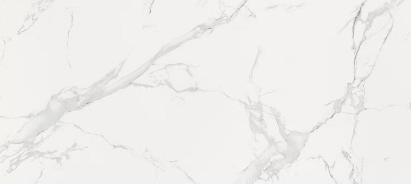
Dekton® Natura 22 is a marble effect sintered stone, with soft grey veining accentuating the classic white surface.
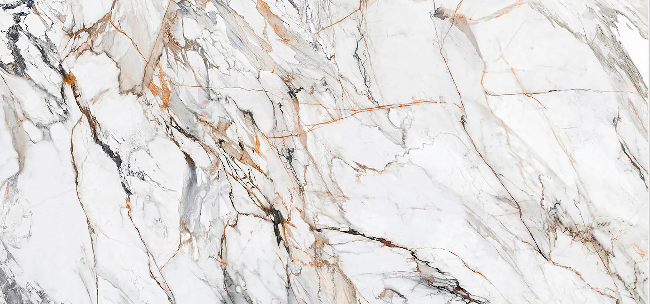
Dekton® Awake

Dekton® Awake has thick veining with gradients of light greys and creams, luscious rusty terracotta, and subtle inky blues.
Dekton® Lucid
Dekton® Lucid has a soft cream base with a mix of golden and blue tones and many shades, reflections, and glints of colour.
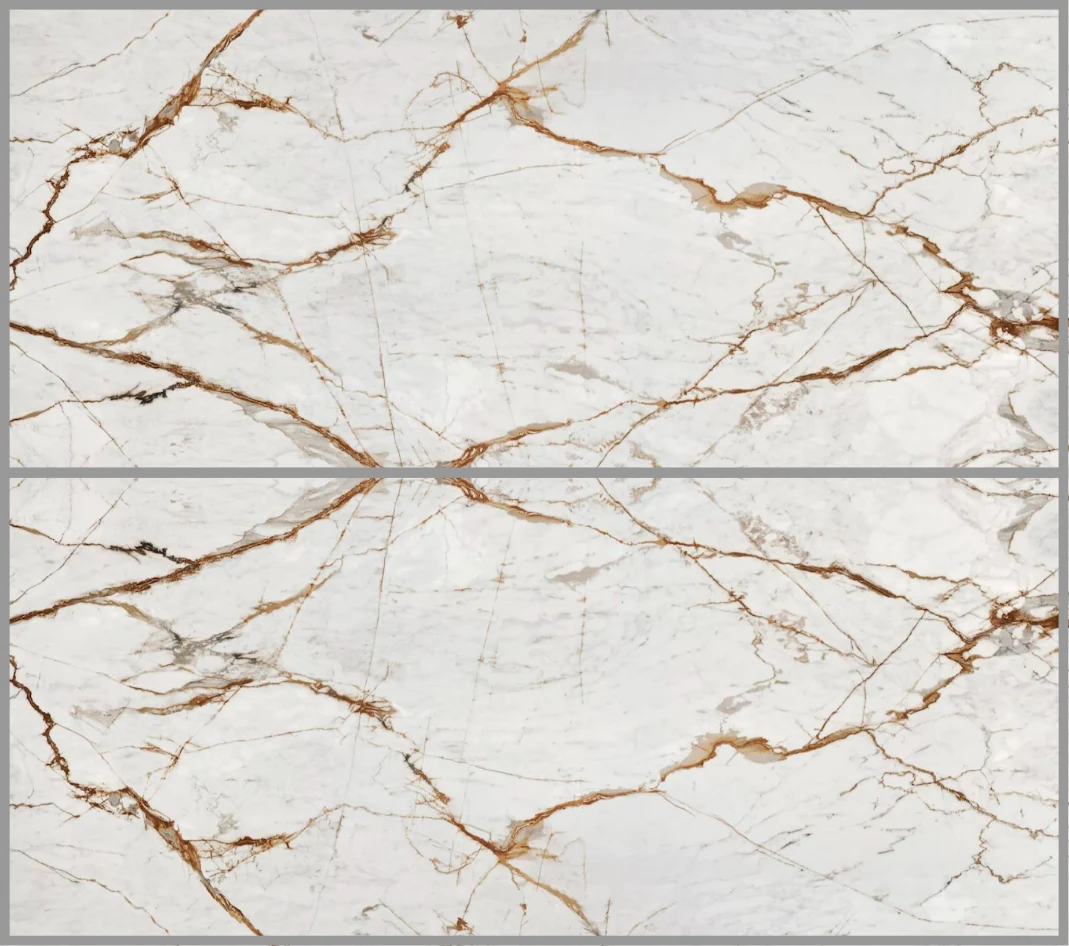
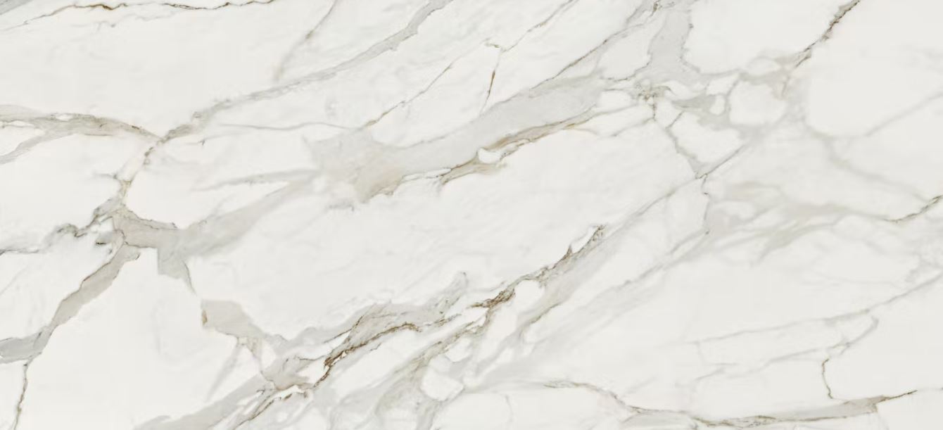
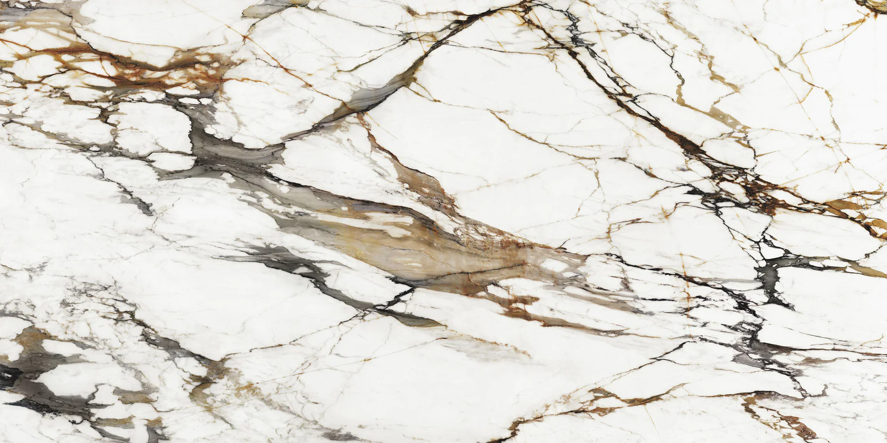
Neolith® Calacatta Luxe
Neolith® Calacatta Luxe has an intricate mix of grey, black, and golden-brown veins on a grey/white background.
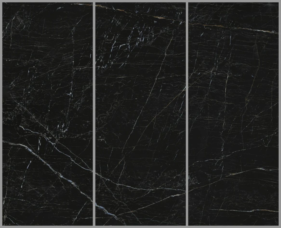
Neolith® Niagara
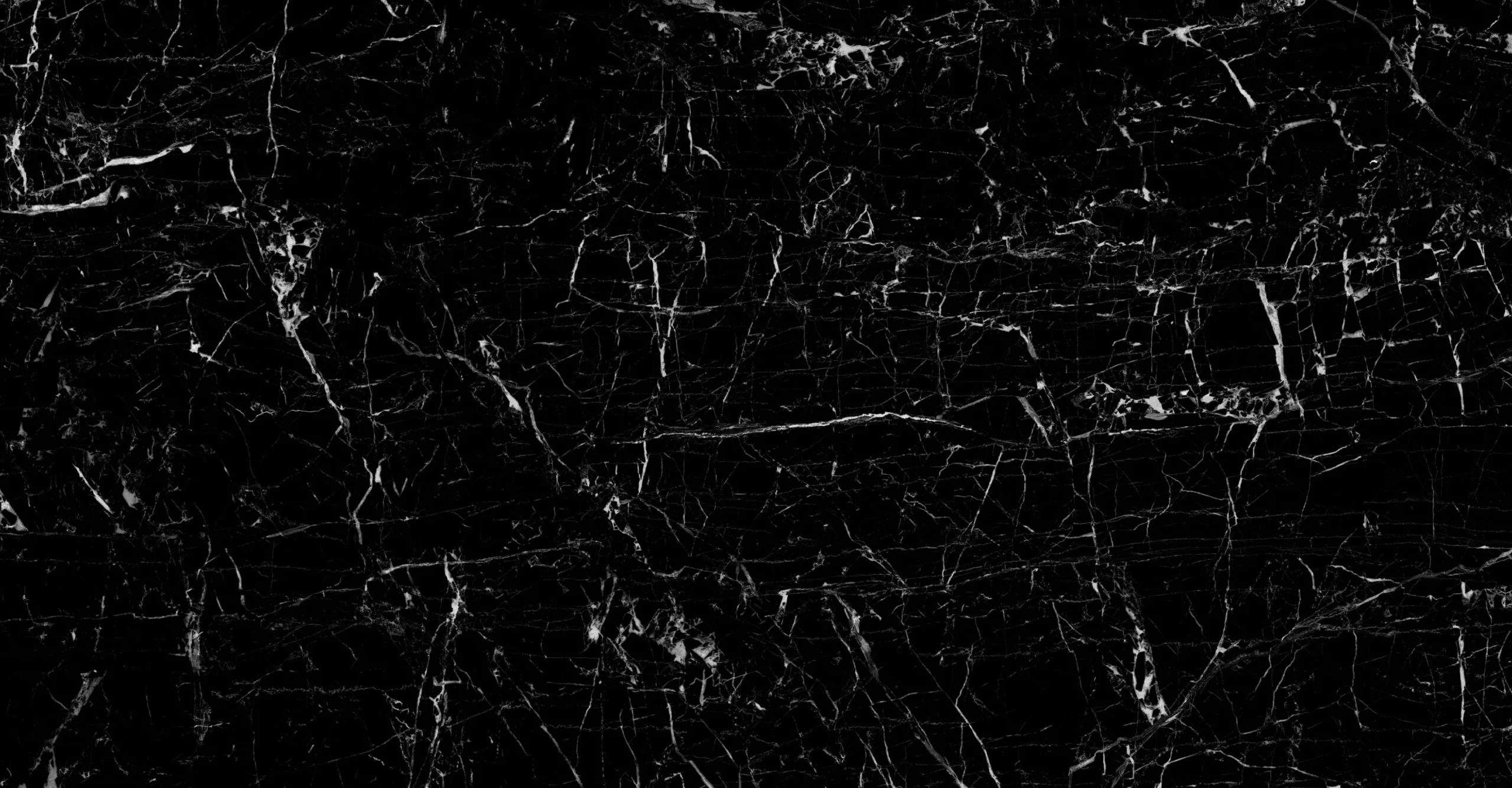
Neolith® Niagara has sharp white veins contrasting beautifully against a black background.
XTONE Paonazzo Biondo
XTONE Paonazzo Biondo is visually striking, with its mix of thick and thin brown and dark veins on a soft white background.
Alternative options
Cosentino, the manufacturer of Dekton® surfaces, has designed two alternative options to book-matching: lineal matching and design matching. Both options are best suited for use as vertical cladding covering large areas. They’re described in more detail below:
Dekton® Somnia – Lineal Matching
Dekton® Somnia is a captivating colour where warm browns and rusty whites merge with a deep black base and a grid of fine lines.
This colour can be lineal-matched, where veining runs seamlessly across two or more slabs, making it look like one continuous piece.
Dekton® Trance – Design Matching
Dekton® Trance is a fluid colour with a bluish veil. The background is a combination of cream and grey colours, and fine streaks move from oxides and fade to reddish gold.
This colour can be design-matched, where veining runs seamlessly across two or more slabs. Each piece can also be rotated 180 degrees, creating a continuous and harmonious design.
Where to buy book-matched sintered stone worktops
From long kitchen islands to stunning splashbacks, book-matched stone worktops offer endless design possibilities.
If you’re ready to embark on the journey to incorporating book-matched stone worktops into your kitchen, we can help. As experts in supplying and installing sintered stone worktops, we’ll guide you through the process, from selecting the perfect book-matched stone colour to ensuring a flawless finish.
SEH Interiors have over 10 years of experience supplying and fitting premium-quality kitchen worktops at affordable prices across the UK.
Browse the sintered stone worktop range.
